Attended a W3C Webinar on the Mobile Web earlier.
One of the interesting things to come out of it, was a plugin for WordPress that makes your blog work better on Mobile devices.
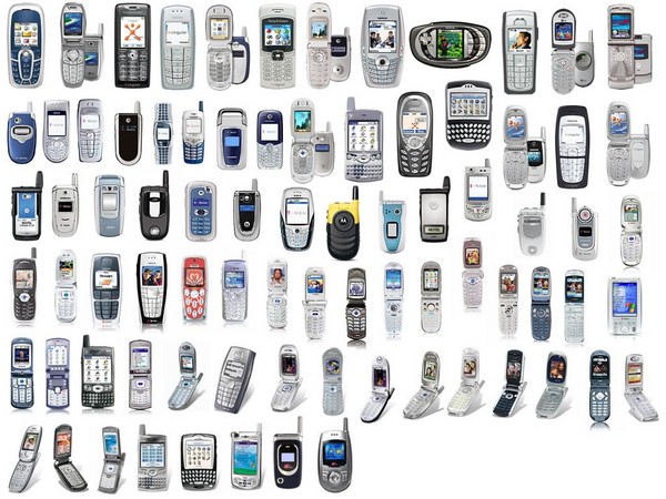
However, this image of the diversity of mobile devices scares me a little.

When I design for hand held devices (not just mobiles, you know!) I tend to design for Opera Mini and Opera Mobile (two different product and rendering technologies!).
It renders Web pages and CSS much better than any other browser for hand held devices. As Opera Mini ships on many phones as a pre-installed application and is being pushed by telcos and works on most phones (only requires GPRS and Java) it is a fair guess to say that it is one of the most, if not the foremost, used browser for hand held devices.
Opera Software’s browsers have always been on the cutting edge of Web standards too. So making Websites look grate on hand held devices is easy with their rendering technology.
Hi Matt,
Just thought I’d let you know that things have moved on since 2006 when you wrote this article.
I’ve created a new mobile plugin for wordpress that uses a device independent markup language so that no matter what device hits your blog, it’ll be served the correct markup. In addition, images are dynamically resized so that they fit the handset perfectly.
The name of the plugin is the Wapple Architect Mobile Plugin for wordpress and the URL is http://wordpress.org/extend/plugins/wapple-architect/
If you want to give it a go, any feedback on it would be very much appreciated!
Thanks,
Rich